Asides

Nintendo know what they’re doing

On why the Nintendo Switch doesn’t need 4K:

How many people are really looking at the Animal Crossing on their TV and thinking “no thank you, it’s not in 4K” or Paper Mario: The Origami King and dismissing the Switch because the graphics don’t have ray tracing? Literally nobody. Players come to Nintendo for quality IP, innovative titles, and long-lasting gameplay, not graphics.

Raymond Wong, Input

This reminds me of the things Android zealots are always insisting the iPhone has to do, things that no iPhone user actually cares about, because Android zealots are “spec-heads.”

I do wish Nintendo would come out with a “Switch Ultra Lite,” which was similarly inexpensive to the Switch Lite but didn’t have a screen at all and was just a TV console.
Leave a Comment

Sacred Bones “Reissuing” the “full” “LP” from “Jeremiah Sand”

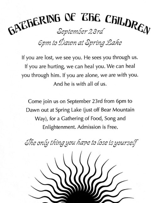
Last Spring I got a flyer included with an order from Sacred Bones advertising a “Gathering of the Children”:

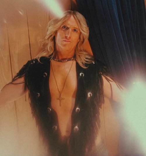
Today I got an email from them with the subject line “Uncovering a maniacal cult leader’s lost psych folk gem!,” which got me really excited. But it turns out to be a full album of music from the fictional Jeremiah Sand from Mandy.

It’s even available as an 8-track!

The Children of the New Dawn have also created a website, “last updated September 21, 1999” (the autumnal equinox, I assume?)

Also check out this sweet Boris Vallejo-like painting of Jeremiah Sand from the Bandcamp page:

Leave a Comment

The typography of Sacha Baron Cohen’s “Who Is America?”

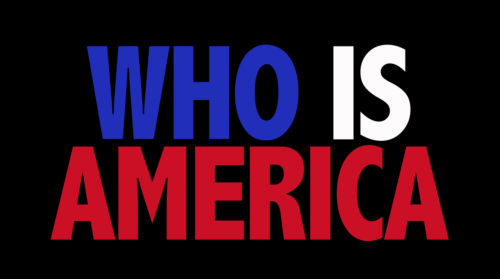
I couldn’t help but notice how jarring the titles for Showtime’s “Who Is America?” are, but I couldn’t put my finger on why. It’s clearly some condensed extra bold, which are often pretty ungainly, with some exceptions (Futura Bold Codensed, of Nike fame). My first thought was that it might be something like Calibri or Tahoma, some unsightly humanist sans that was even possibly manually stretched.

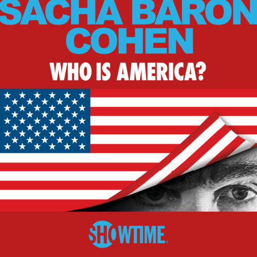
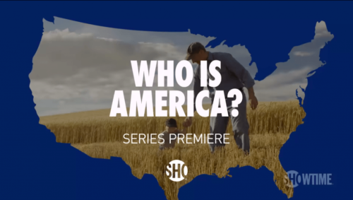
I Googled around for a screenshot of the titles, and what I found instead was a lot of promotional material that primarily does use Futura Bold Condensed:

(And Arial Bold, unfortunately.)

I can’t help but wonder if the designers behind the titles in the aired show were trying to mimic Futura Bold Condensed, but either weren’t able to or didn’t know they weren’t using the same typeface.

I admit I had to look it up, but the typeface they are using is Abadi Condensed Extra Bold. Why this typeface? After a little more Googling I learned that Abadi is included in several Microsoft products.

What isn’t included in most Microsoft products? Futura Bold Condensed.

Leave a Comment