9 posts with tag “foobar2000”

Alphabetization Is Not Fit for Music Libraries

Wikipedia’s article on alphabetization explains:

Advantages of sorted lists include:

  • one can easily find the first n elements (e.g. the 5 smallest countries) and the last n elements (e.g. the 3 largest countries)
  • one can easily find the elements in a given range (e.g. countries with an area between .. and .. square km)
  • one can easily search for an element, and conclude whether it is in the list
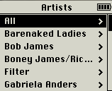
The first two advantages are things you almost never need to do with music libraries. And the third has been supplanted by now-ubiquitous search boxes: if you know what you’re looking for, you search; and if you don’t, an alphabetized list is not the way to find it.

Web visionary Ted Nelson (<mst3k>Dr. Ted Nelson?</mst3k>) has been paraphrased as pointing out that “electronic documents have been designed to mimic their paper antecedents,” and that “this is where everything went wrong: electronic documents could and should behave entirely differently from paper ones.” If the folder metaphor is inadequate for digital documents, no wonder it’s so pitiful at handling music. The proximity between pieces of music in a library should least of all be based on the first letter in a band’s name – it’s as arbitrary as sorting them by the vocalist’s month of birth – yet this is how it’s universally done.

Music library organization needs to be re-thought from the ground up. We need to consider how it is that people used to listen to music before it was all on their iTunes. How are your CDs organized (or disorganized) on your shelf? How are they organized in your head? What is it that prompts you to listen to what you listen to when you listen to it? And how can we use computers to adopt and enhance these ways of thinking, rather than forcing us to think like computers? Continue reading

17 Responses

foobar2000 Is Dead or Dying: Part 1

Originally written June 30, 2007.

There’s always been a significant faction of foobar2000 users whose primary attraction to the player is its appearance, or rather the level of control given to its users over its appearance. In its infancy, with the standard (and still default) UI, very little was possible — the main window consisted solely of a tabbed playlist and several functional toolbars — but people nevertheless took a lot of pride in making it their own, and some impressive things were done with relatively minimal flexibility. It was in the standard UI that users began experimenting with album-level presentation, choosing not to repeat redundantly the artist and album name on each line of the playlist, but to use the second, third, and sometimes fourth lines to display other info, such as year, label, genre, replaygain info, etc. Each of these customizations was unquestionably unique, but most of the broad details of the interface were consistent and inescapable.

The Columns UI component began as an experiment in allowing for multiple columns within the playlist display, emulating the Windows Explorer “Detail” view (and many other Windows programs), with sortability via clickable column headings. Eventually Columns UI added a sidebar and, later, panels, allowing the whole foobar window to be split up indefinitely into panel-based component displays, the playlist viewer becoming just another one of these. This granted much greater flexibility, allowing users to tailor the interface even more precisely to their needs. You could now display album art as prominently as you wanted, or not at all; your entire library tree could be embedded within the main window, rather than tucked away in a pop-up; and with the trackinfo panel’s exceptionally lax (by that era’s standards) stylizations, the personalization of your foobar became even more addictive, and, more importantly, rewarding.

Many seemed hell-bent on concocting the most garish presentations imaginable: giant gothic blue-on-black custom fonts, deep-red 200-px-tall spectrum analyzers, all, of course, coupled with custom OS “vis.”

While some still preferred the purity and elegance of the standard UI, the personalizations made possible by Columns UI were inarguably functional ones, for the most part. Fonts, colors, distribution of panels, and a rudimentary method of text alignment were really as far as you could go. At the core of all the boasted screenshots was a recognizable structure, all slight variations on the theme of playlist+trackinfo+albumlist+albumart. Outside of displaying album art, there was nothing profoundly new that Columns UI allowed you to do — rather, Columns UI gave you more control over how you did what you needed to do.

Continue reading

12 Responses

Hotness 1.6.c.1

Totally warranted subversioning!

My foray into MP3Toys was ultimately short-lived, brought to a halt when I found what people were doing with Single Column Playlist for foobar, particularly the playlist-embedded album art. Back in the foobar saddle, I also gave in and tried out the “official” Play Count component, which I had avoided for so long because it didn’t support %FIRST_PLAYED%, and because I wasn’t sure I wanted my playback statistics only kept in the database — even though writing them to the files posed a lot of trouble as well. Turns out, playback statistics stored by the official component are less sensitive to changes to the files it’s keeping track of than the unofficial one, which means I only have to be a little careful to keep all my stats intact, while being able to play and track files that I’m still seeding.

This, along with the invaluable $cwb_datediff() function provided by Bowron’s new foo_cwb_hooks component, called for a rewrite to the hotness code, which had been stagnating in some marginally compatible 1.5 version since May. After severely trimming the code down and robusting things up, I thought of a new and totally non-arbitrary way to soften the blow hotness scores receive when songs are played. I hated seeing them leap to 100 every time, and this new softening method makes so much sense, utilizing existing baseline calibrations to keep things a lot more interesting. How anybody tolerated the old method is beyond me.

Anyway, here it is.

I also dug up a lot of old screenshots this week and I’m planning a nostalgia-fueled retrospective in the near future.

Leave a Comment

MP3Toys

This will come as a shock to anybody who knows me, but I’ve all but stopped using foobar2000. A couple months ago on the indietorrents forums, somebody mentioned MP3Toys, and I’ve been using it almost exclusively since.

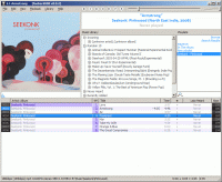
MP3ToysAs I mentioned in a previous post, all the chores I was made to do in foobar seemed to keep me from listening to music: I was working for my software, and not vice-versa. My collection of music felt cold and dead and fragile in the hands of foobar, and none of the features I had idealized in my mind were anywhere near fruition (true hotness, similarity-by-mood filters, etc.). I desperately wanted something to get me back in touch with my music, something that delivered music to me in a way that felt as natural as buying a CD and putting it in my stereo. I even considered switching to iTunes.

MP3Toys isn’t for every foobar user; I just got lucky enough that it emulates my ideal behavior in foobar. It’s a living, breathing program, and using it is a humanistic experience. It understands not just that you listen to music, but why you listen to music. Some of its intelligent features include:
Continue reading

4 Responses

Intelligent browsing in foobar

Collecting my thoughts here…

foobarSo, ironically, music is becoming increasingly difficult for me to listen to. As though worrying about an extensive gauntlet of tagging procedures isn’t enough, I just have too much damn music. Browsing alphabetically through upwards of 500 artists is not the best way to go looking for something when you have no idea what you want to hear.

I’ve auditioned various methods of tweaking foobar to ‘deliver’ music to me more or less automatically, and I’m close to having something ideal. The playlist tree component allows for dynamic tree structures (which, unfortunately, can only be rebuilt manually or every time a new song begins); using the titleformatting language, I’ve generated five queries whose purpose it is to ‘coax’ certain albums to starker visibility from the featureless and indifferent music library, to greater or lesser success.

Continue reading

2 Responses

Slightly Streamlined mp3 Tagging Flowchart

I used to require four programs for getting all my tags exactly how I want them: The GodFather (with AllMusicGuide patch), the MusicBrainz Tagger, Mp3tag, and foobar2000. The GodFather was always the first and worst part of my tagging procedures, being slow, refusing to write APE tags, and relying on the Internet Explorer engine.

Now I’ve eliminated both The GodFather and MusicBrainz from the whole grueling process, boiling it down to just Mp3tag and foobar2000, thanks to an AMG-scraping script and a MusicBrainz-scraping script for Mp3tag. The only drawback is that the AMG script doesn’t retrieve album descriptions (which I truthfully won’t miss a bit), and that the scripts use different tag field names (MOOD instead of TONES) to store some of the more frivolous metadata.

However there is some promise in the relative simplicity of Mp3tag’s scripting language, which, with enough knowledge of regular expressions, seems to be capable of parsing anything out of an http request.

Leave a Comment

AllMusic’s Tone Intersections

In a previous post about A Flat Hierarchy for Subjective mp3 Tags, I described the arduous and marginally rewarding task of tagging my entire library with as many ‘tones’ tags as AllMusic was able to provide. With foobar2000 0.9 final now less than a week away, these tags may prove useful soon enough. But a few weeks ago, impatient and curious, I decided to put them to another use:

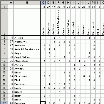
tones intersection chart

By creating a tones/tones tree structure in foobar, I was able to count how often each ‘tone’ intersects with every other ‘tone.’ What you see above is the beginning of that data collection, which I ultimately planned to analyze in…some way.

After Googling around for ideas on tag clustering, I came across gCLUTO, a free piece of software that would, miraculously, do exactly what I needed — namely, magically figure out how best to cluster each tag with related tags. I figured four clusters would be a comfortable number, based on earlier reading I had done on a two-axis theory of musical emotion (intense/relaxed and positive/negative).

topographical cluster visualization

Unfortunately, my computer simply couldn’t handle even constructing and deconstructing the foobar tree without freezing up for about 45 minutes each time. Plus, collecting all this data would have meant hours and hours of work, for a goal whose benefits weren’t very clear to me at all, as well as a halt in incorporating new downloads into my library. It was a pretty exciting couple days while it lasted though.

3 Responses