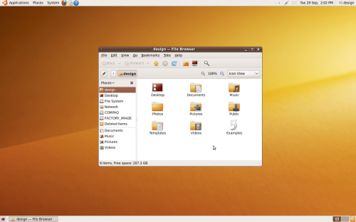
As shown here and here, among other places:
- The titlebar height is not quite tall enough to comfortably contain the titlebar text.
- The titlebar text shadow is too prominent, and conflicts with the glossy 3D appearance of the titlebar.
- The titlebar button borders and symbols are too high-contrast, and the symbols are off-center by one pixel.
- The window corners are not anti-aliased.
- The notification area icons are too low-contrast.
- The new wallpaper is a little lifeless.
Some positives are that the new Humanity icon theme is a great improvement, and that the font rendering continues to impress.

Troy James Sobotka says:
There is far more than your list to gripe about.
*) Titlebar height? How about we ditch the heavy handed double bold screaming title type? I imagine they are looking at bumping it up a few more points in the name of blind usability. If elegant had a face, it probably isn’t George Foreman’s after a title bout.
*) The win deco boxes. If there is one thing that screams louder than the red, yellow, and green gems of Apple it’s the boxy blockness of Microsoft decorations.
*) The new wallpaper is the most recent in a long, long, long lineage of ‘must be neutral’, ‘must be dark in the top left corner’, ‘must be monochromatic’, etc. Perfect symmetry speaks one thing and one thing only – no, it’s not ‘harmony’ or ‘balance’ – it’s hobby composition.
*) Palette? Dropper swab all of those tones. Chalk one up for zero concept and zero audience. Chalk another up for a blatant disregard of emotional connection. Finally, chalk up the killing blow for even a remote sense of colour harmony.
*) Finally, if we look at the separate parts, where is the continuity? From logon to GDM to desktop, it’s a nasty hodge-podge of appearances. Looks like ants went out hunting and brought back discreet components from several picnics…
*) Agree with Humanity as an improvement. That said, how difficult is it to escape the blighted and ‘done-like-dinner’ trend known as gloss? Plopping Windows 3.1 icons in there would be an improvement. Of course, we would probably need to give them some of that lovely heavy-handed Tango 16 point outlining too.
I guess the nitpicking comes when there is little to discuss or get excited about. Weak execution coupled with weaker vision pulls us further along the path of mediocrity.
A great, huge, typical ‘Karmic is going to ROCK’ meh.
Great blog. Looking forward to reading more.
Jay says:
Wow, thanks for the long response. I can’t say I disagree with you, but at this point in Ubuntu’s history I’m willing to give them more than a little slack. Karmic is the first release that had input from any professional designers, as a result of the new Ayatana project, and I think they’re just getting their feet wet. They need to keep some things consistent — I’m sure more than they’d like — just for familiarity’s sake.
Of all the things you mentioned, the heavy black shadows on the bold titlebar fonts is the one I wish I’d made a point of noting. Broad usability is one thing, but if you’re that visually impaired, you’re going to need to make a lot of changes to the default desktop anyway.
Also, nice jab at the Tango project. It’s an admirable endeavour, but its results are far too “playful” or “childish” to be considered neutral. That’s why I’m glad for things like Humanity, although I’m sure there are many people clamoring for Ubuntu to go all Tango all the time. And as far as gloss goes, Humanity, I think, keeps things relatively subtle. I mean, have you seen some of the icon themes on GNOME-Look.org?
I think maybe the fundamental problem here is that visual aesthetics are the last thing you want to leave up to a committee. Without the singular, inspired vision of a very small handful of people, you can’t hope for anything other than mediocrity. And there is a difference between neutrality and mediocrity. I just wish there were somebody at Ayatana with the balls to take Ubuntu into a bold and decisive direction. I don’t agree with most people, however, that they need to ditch the orange/brown motif. Those are fine colors, if used right, and are already synonymous with the Ubuntu brand. Changing to something like blue would be suicide.
Troy James Sobotka says:
So spot on in so many ways!
If you know anything of me or the people I have spoken with, I am one of the few proponents of keeping brown. Brown is a beautiful tone when, as you stated, handled correctly.
What cracks me up is that we have the buffoonery that believes shifting a tone will yield results. It won’t. It is about design. We can be bland tepid mediocre in any colour. Look to SUSE if you need further proof.
What is even more hilarious is the fact that – lo and behold – brown is back to chic. Nike? Hell yes. KSwiss? Yes. Dakine? Yep, there too. Quicksilver? What do you know? If you have any respect for the design standards at Starbucks, you would be a fool to not notice the craftsmanship application of earthen tones…
About the only thing I disagree with you on is your “Karmic is the first release that had input from any professional designers”. You do realize that Mr. Shuttleworth has paid for all of the art and design work up to this point as well? This includes but isn’t limited to the shirtless model wallpaper (http://davyd.ucc.asn.au/images/ubuntu-desktop-pr0n.png), the Humanity glossy rounded icon set, the default wallpapers (exceptions being Hardy and Intrepid), the CD covers, etc.
So the nasty word ‘professional’ rears its head again. Surprise! It’s all pro all the way! Do we expect any different now? ;)
Great blog. Blog more. Period.