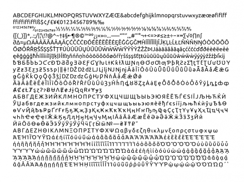
When Mark Shuttleworth announced the rebranding of Ubuntu, it seemed nobody noticed that he mentioned a new system font was being developed. Currently Bitstream Vera Sans is the default (if I’m not mistaken), appearing on menu bars, title bars, buttons — pretty much everywhere. I’ve always thought it has served its purpose well, and was frankly a little worried that they wouldn’t get the new system font right. Type design is extraordinarily tricky.
Now however details are starting to emerge. OMG! Ubuntu! describes how to get a bootleg copy of it. And at UDS back in May, Bruno Maag gave a session entitled “Making Beautiful Fonts” in which he elaborated on the creation of the new font. There is now video of that session, as well as the slides, which were sadly not included in the frame.
My first impression is that it feels a bit too stiff, rigid, and tech-y. Of course there’s no way to tell until you use it on your desktop. Reassuring, however, that they’re giving it proper italics.

Troy James Sobotka says:
“My first impression is that it feels a bit too stiff, rigid, and tech-y.”
Amen.
What is fascinating is that with all of the Droid and (apparently) above focus on context (which _is_ wholeheartedly required), it appears to be a context from the distant past (READ: 2-4 years).
The question I offer is:
If 300 DPI is a print standard that displays the subtleties of serifs and such, why is it that we seem so vehemently focused on the 90 DPI zone?
To me, as a pure lame duck, this looks like a monumental amount of effort to effectively create a set what amounts to a bitmapped font.
To the people looking forward, I’ll put my money on high density displays becoming the norm within a year on mobile and like devices. If such is the case, expect to see more well crafted type to emerge without the Jurassic era rationalist rigidity.
Someone, somewhere, for some reason, apparently decided that display type would make a wonderful body copy type. It certainly looks like the hobgoblin’s consistency (likely moored in a dismal bit of theory) rearing its ugly head.
Makes perfectly good sense doesn’t it? That’s why Apple set all of their identity work in Chicago right?