This isn’t the first time I’ve encountered hinting; I’ve seen it before in GIMP, even when I was using it in Windows, this font rendering option that was inexplicably on by default, and resulted in horrible kerning and misshapen letterforms. I don’t claim to know a lot about the technicalities of hinting, but everything I do understand about it agrees that it is meant to improve the shapes of letters. If this is the case, somebody is doing something very, very wrong. I haven’t seen a hinted font that looked anything other than sickly and disheveled.
I’ve complained before about the typography in Ubuntu, but my contention then was with the fonts that were in use by default, not with the way they were rendered. What I didn’t realize at the time is that the rendering is the bulk of the problem.
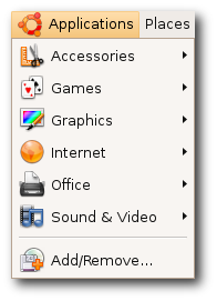 I found this image on the Ubuntu site, and I am still in disbelief that they choose to represent themselves with font rendering like this. Look at that capital ‘A’ and ‘V’; look at the way that lower-case ‘l’ towers over its neighbors, nothing more than a single-pixel-width vertical line; look at the kerning in the ‘Rem’ of ‘Remove’ – it’s no wonder Ubuntu has about a 2% worldwide market share. They expect people to want to look at that every day of their lives? I know these are relatively subtle details, but their effects are subliminal and, I believe, psychologically hazardous.
~/.fonts.conf
Of course, when it comes to Linux, for every problem there are a few dozen solutions – or one very, very complicated solution. GNOME, the default desktop for Ubuntu, arrives with a “Font Rendering Details” dialog box in its appearance settings, to placate the mouth-breathing philistines who need a GUI to get things done. And it doesn’t really help much. I knew I’d have to get my hands dirty in ~/.fonts.conf, this XML file that is capable (and only capable) of incredibly fine-tuned font tweaking.
[Fonts are] the #1 reason why Linux hasn’t seen any significant adoption on the desktop/laptop yet. Robert Scoble
The trouble, as is the case with most Google results you get when looking for help with Linux, is that there is a glut of quick fixes, blocks of code directed towards one specific person and their specific system, that they are then told to paste into a file or save into a directory, with little to no explanation about why this solution is going to work. Or there’s the technical documentation that isn’t geared towards users. There’s no middle ground (unless you count the occasional, skeletal wiki that hasn’t been updated since 2004).
Only after looking at countless ~/.fonts.conf examples was I able to glean what was going on inside them. The full power of this file allows you to target with amazing precision any variant or size of any font your system might display and give it its own unique properties; but there are really only three(ish) of these properties that you need to know about, and I am going to explain them here.
antialias
Anti-aliasing is the trick that makes your pixels not look like pixels. You’ve noticed this when you’ve seen poorly resized images with jagged edges – they’re not properly anti-aliased. Similarly, if fonts are not anti-aliased, they look like black Tetris pieces on a white background. Anti-aliasing is going on all the time without you knowing about it, and you’d really have to make an effort not to have it, but it’s worth putting in your ~/.fonts.conf file for good measure. You’ll want to apply it to all fonts on your system, so the syntax would be:
<match target="font">
 <edit name="antialias" mode="assign">
  <bool>true</bool>
 </edit>
</match>
You can probably figure out what these things mean, but I will link to a complete manual for ~/.fonts.conf syntax at the end of this post.
rgba
This one is a matter of personal preference, I guess. I don’t see how anybody of sound mind could stand to have pink, beige, and turquoise pixels sprinkled around the edges of their letters – the result of “sub-pixel rendering” – but I guess the argument is that it allows them to be sharper. Whatever.
Trust me when I say that things look best if you tell ~/.fonts.conf to disable sub-pixel rendering, which is done like so:
<match target="font">
 <edit name="rgba" mode="assign">
  <const>none</const>
 </edit>
</match>
If you happen to be schizophrenic, or colorblind or whatever, then yes, fine, you can turn on sub-pixel rendering by changing none to rgb, to reflect the composition of your monitor’s subpixels (which are almost certainly in the order Red-Green-Blue, from left to right). Have fun scratching your eyeballs out.
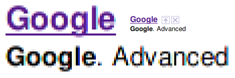
rgba=rgb
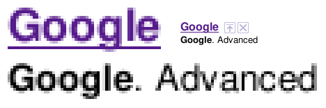
rgba=none
Admittedly it would be nice if there were some antialiasstyle property you could set to antialiasslight or something, to lighten up those gray pixels a little bit.
hinting / autohint / hintstyle
Put it on my tombstone: Turn Off Hinting. I’m begging you. If somebody tries to tell you that this is a matter of preference, they are lying to you, and are not your friend, and are probably banging your girlfriend. If you leave hinting on, Georgia will not look like Georgia, Lucida will not look like Lucida, and Nimbus will not look like Helvetica.

hintstyle=hintnone
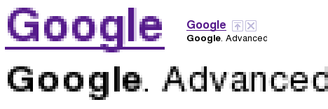
hinting=true, autohint=true
Here is how you Turn Off Hinting®:
<match target="font">
 <edit name="hinting" mode="assign">
  <bool>false</bool>
 </edit>
 <edit name="autohint" mode="assign">
  <bool>false</bool>
 </edit>
 <edit name="hintstyle" mode="assign">
  <const>hintnone</const>
 </edit>
</match>
Alternatively, if you positively demand more “crispness” from your fonts, even at the expense of aesthetics, you might want to give slight hinting a try. From the above code, change hinting and autohint to true, and hintstyle to hintslight:
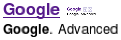
hintstyle=hintslight
That’s it, roughly speaking. It’s my understanding that some specific fonts do look better if specifically targeted and adjusted with maybe slight hinting. But that’s for another day. If you do as I’ve instructed, things will be so much better for you. Leave a comment if you want my PayPal address.
This post would not have been possible without the help of these sites:
- ArchWiki: I know nothing about Arch Linux, but this wiki page has a lot of good info.
- fontconfig.org: the most complete and recent ~/.fonts.conf reference I’ve found.
- Ubuntu Wiki: contains an example of a very comprehensive (if dated) ~/.fonts.conf file. Study it and learn how to do other stuff.
- The Masterplan: another sample ~/.fonts.conf file, and the only other one that I know of that turns off hinting and subpixel rendering.
Biju Kunjummen says:
Thanks for the font tweaking tip. It really improved the look of my Ubuntu Jaunty – in combination with a font size of 9 (from the default of 10), the fonts look beautiful now.
Jay says:
Glad to know it helped, Biju. I’m still very pleased with the way this makes things look. It’s also useful to browse through all your font preferences — in Appearances, in Firefox, etc. — and make sure everything is set to a good font; DejaVu instead of Sans, for instance. UnDotum makes a great titlebar font.
Matt says:
Thanks ever so much for this helpful post. I’ve been searching linux forums in vain for a proper fonts.conf setting. Everyone seems perfectly happy with rgba turned on and hintfull — I, however, found myself getting headaches from all the color halos and awful kerning. In fact, when I first arrived at your site, the letters were smashed together from a disastrous hinting setting. Now, everything looks very elegant — and no more headaches!
kmc says:
Although you put something to extremity, I agree with most of this post. I did tune much according to your post with fonts.conf, yet finally I just use the easiest way: choose “best contrast” (which means gray-scale, hinting full), I thus turned off rgb hinting and use only gray-scale hinting and I’m rather happy. Being a gdi++ fan, I still think there’s huge job left for Linux developers, though.
Thanks.
Abe says:
The sub-pixel rendering blow-up isn’t really a fair representation unless you cut the blown up pixels into R, G and B stripes. The blue stripe on the lower case L in Google is really 2/3 black with a blue stripe in the last third of the pixel. Who sits close enough to their screen to see individual pixel components, anyway?
Jay says:
Abe: You are right, it was a little lazy of me to do blow-ups like that. They weren’t so much to “prove” that subpixel rendering looks bad as they were to see more closely what’s going on. I suppose I could have been clearer about what we’re looking at, though personally I think the normal-sized text is enough to show that subpixel rendering looks bad.
Jack says:
To me this is the wrong way around. On 8.10, if I turn off hinting, I get the kind of rubbish that you posted from the ubuntu website. Bad kerning, unbalanced lettering, wildly varying density of text when you squint at a paragraph, etc.
Are you using firefox 3.5beta? Ive noticed the beta is very significantly deficient when it comes to font rendering – particularly if you have rgb subpixel rendering turned on. On FF3.0.5 with rgb, antialias, autohint, hintfull, you can barely detect color fringing. On 3.5beta, it looks appalling, particularly light text on a dark background, or when you select text. The balance is OK, but the color fringing is terrible.
Jack says:
Actually, Ie noticed this varies a lot depending up the zoom factor I use in firefox. The other point is that Iḿ running on CrunchBang linux, and I think the libs have the proprietary hinting code enabled, so hinting probably looks much better than the stock ubuntu libs.
Flavio says:
Thanks for finally making font rendering clear. Every serif font looked awful! I mostly blame autohint… and I agree with you: turn it off already!
Jay says:
@Jack: Yeah, I am running Firefox 3.5. When I wrote this I was probably running 3.1 beta 3 or something. But the problems with fringing and hinting seemed to extend beyond Firefox, so who knows. And I think it was in 8.10 that I was testing these things out. There are too many variables to really single anything out as the culprit, although because I am running a pretty stock install of Ubuntu, I am assuming that most novices like me will probably be getting the same results.
@Flavio: Glad to help! I was also enormously relieved to finally be happy with the way text looked in Ubuntu. It’s amazing what a difference it makes.
Daniel says:
Nice! I find font hinting (on both Windows and Ubuntu) so bad that sometimes I struggle to determine whether a space is an inter-character space as opposed to an inter-word space.
The other major rendering issue is the lack of gamma correction. (I imagine using a decoding gamma of 2.5, blending and re-encoding with gamma=1/2.5 should work well, since font rendering is not subject to the rendering intent of the encoding gamma of 1/2.2 for images view in dim surroundings.)
As it is, font stroke weights vary according to their orientation and position. It’s hard to tell what is meant to be bold and what is not. Sometimes in order read a bit of text I have to make a screen snapshot and apply the correction in Photoshop myself (mainly with Adobe’s Acrobat Reader). A black vertical line one pixel wide exactly centred on the boundary of two adjacent pixel columns should have values RGB(193,193,193) in each column.
Obviously this will lighten the overall text somewhat. That’s because the font weight was chosen to look as best as possible on rendering systems with no gamma correction.
It’s kinda odd that most people don’t realise they are working with compressed images. (They are gamma-compressed.) All image arithmetic – scaling, blending, dithering and transparency handling – needs to be done with uncompressed images.
bath says:
As someone who cares a lot about font display and typography in general I sympathize with these frustrations, but I’m pretty sure nothing was done by editing the font config file that isn’t easier for most users to accomplish through the Appearance Preferences GUI (Fonts tab … but then click ‘details’).
The effectiveness of subpixel rendering varies depending on the monitor and, to some extent, the way the font happens to line up against the pixel grid. On both of my computers, it works beautifully, a major boost to the horizontal resolution. I’ve seen that headache-inducing aura on some screens, but people who complain that subpixel rendering is unequivocally a nuisance should consider that their hardware may not represent the typical experience (i.e., no, your eyes aren’t more sensitive than ours). (Disclaimer: I don’t mean to suggest the author thinks this.)
I find myself occasionally switching between no-hinting and slight-hinting. Neither is quite right. What would be great (for subpixel users anyway) would be something like “vertical hinting only.” Using slightly larger font sizes than is standard can make things look a whole lot better, if you’re willing to adjust to it. The more recent MS fonts are of excellent quality and carry over beautifully.
Disciple of "Bob" says:
These instructions are fantastic if you enjoy text that looks like it was written on a paper towel with a felt tip pen. If, on the other hand, you actually read text and don’t just consider it decoration, you’ll want to skip this and let the “crispness” win out over the “aesthetics” that gives the author the vapours.
Jay says:
Do not listen to this man! He means to deceive you!
@Bath: Actually, choosing “None” in the hinting section of font appearances doesn’t truly remove hinting, it only reduces it to slight. Weird, huh?
bluegeek says:
How the gnome fonts settings interact with the fonts.conf settings? which one prevails? do I have to reset the gnome font settings?
Jay says:
Good question, bluegeek. ~/.fonts.conf is processed after the GNOME font settings, thus taking precedence over them. So nothing should be affected by the GNOME font settings.
walley says:
fullhintig and antialias off is the way to go!:)
Jay says:
:SHAKES FIST:
imercado says:
EXCELLENT post. I came to this site after wondering what “hinting” was and I had also noticed that there wasn’t nearly enough variation between the available font choices, so THANK YOU very much for clearing that up! After using Windows and Macs for so long, I, too, was very disappointed with the “Kindergarten” feel of the default Ubuntu font rendering.
I agree with BATH that it’s much easier (and safer) to make most of these changes in the Appearance item in the Control Center (Ubuntu 11.04). After swapping back and forth, I found DejaVu Sans Condensed to be a great choice and it gave me slightly more screen real estate than Trebuchet MS (suggested in another blog regarding installation of the MS True Type fonts). For me, I needed the Subpixel smoothing as opposed to the Grayscale, which doesn’t work well against certain background colors.
2Karl says:
Thank you so much for finally allowing me to turn off those ghastly coloured glows around my letters. Incidentally, I was also able to turn off the LCD filter, as I still have a CRT screen. My fonts look wonderful. (Gentian Book Basic for serif, Actor for sans-serif and Ubuntu Mono for monospaced, if you’re interested).
DA says:
Dude what did you expect with open source fonts. License commerical grade typefaces….Why would anyone spend the time to hint and tune open source fonts for free? Windows, mac windows xp vs windows 7, flash, IE, Firefox all render fonts differently….I’ve never seen any open source fonts used in a professional enviorment unless the company is straight up cheap.
Jay says:
Because I have no control over what fonts websites use, and I want them to look as good as possible for me. I’m not talking about doing print design from an Ubuntu box, I’m just talking about onscreen rendering for *all* fonts, free AND commercial.
Rafael Kafka says:
Thank you a lost and Merry Christmas! You’re a life (and eyes) saviour!
lel says:
Looks like crap without hinting.
Ebin troll
dannymichel says:
Bro, i Agree with everything you’re saying. Problem is the shapes render correctly when hinting is off, but it’s so blurry. Slight hinting just ruins all the shapes. Actually, all the font shapes are pretty much perfect other than Helvetica Neue. Take a look here. Mac on top – Linux on bottom. Mac’s version is taller. http://goo.gl/kO4iVG
Jay says:
Yeah, that’s the trade-off, dannymichel. If no-hinting is too blurry for you, but slight hinting ruins the shapes too much, you might want to try no-hinting with RGB subpixel rendering.
Helena says:
Beautiful. Thanks very much for the tweaks :)
Joachim Lous says:
Hint: Autohinting is not the same thing as proper hinting.